How I got started in Football Visualisation
My journey into sports visualisation all started with the Tableau Tunnel series, created by Ninad Barbadikar. In this tutorial series, Ninad begins by professing his lack of deep data expertise and explaining his want to find answers to the all too common questions you would hear from friends or social media after watching the big game, and how data could help him move beyond emotional reactions and formulate objective opinions on player performance.
After this welcome to the world of visualisation, Ninad then introduces us to Tableau, software that lets you tell stories with data using stunning visuals, and explains the reasons as to why he used Tableau. Namely, that it is very user-friendly, and does not require any knowledge of coding, which makes it quick to get started with.
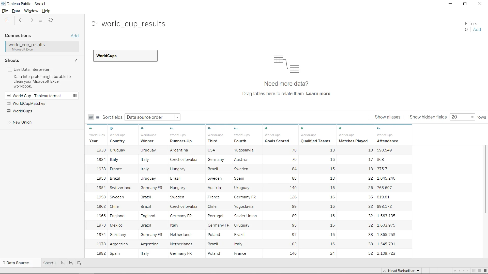
We start off by connecting to our data source, fortunately, Tableau offers a free Football dataset in its resources section, which provides us with data from FIFA World Cups, this eliminates hours of work that could have been spent finding data, cleaning it, and preparing it for use in Tableau. Although these are vital skills for an analyst, they are beyond the target audience for Ninad’s tutorial series, and would take up more time than the visualisations.
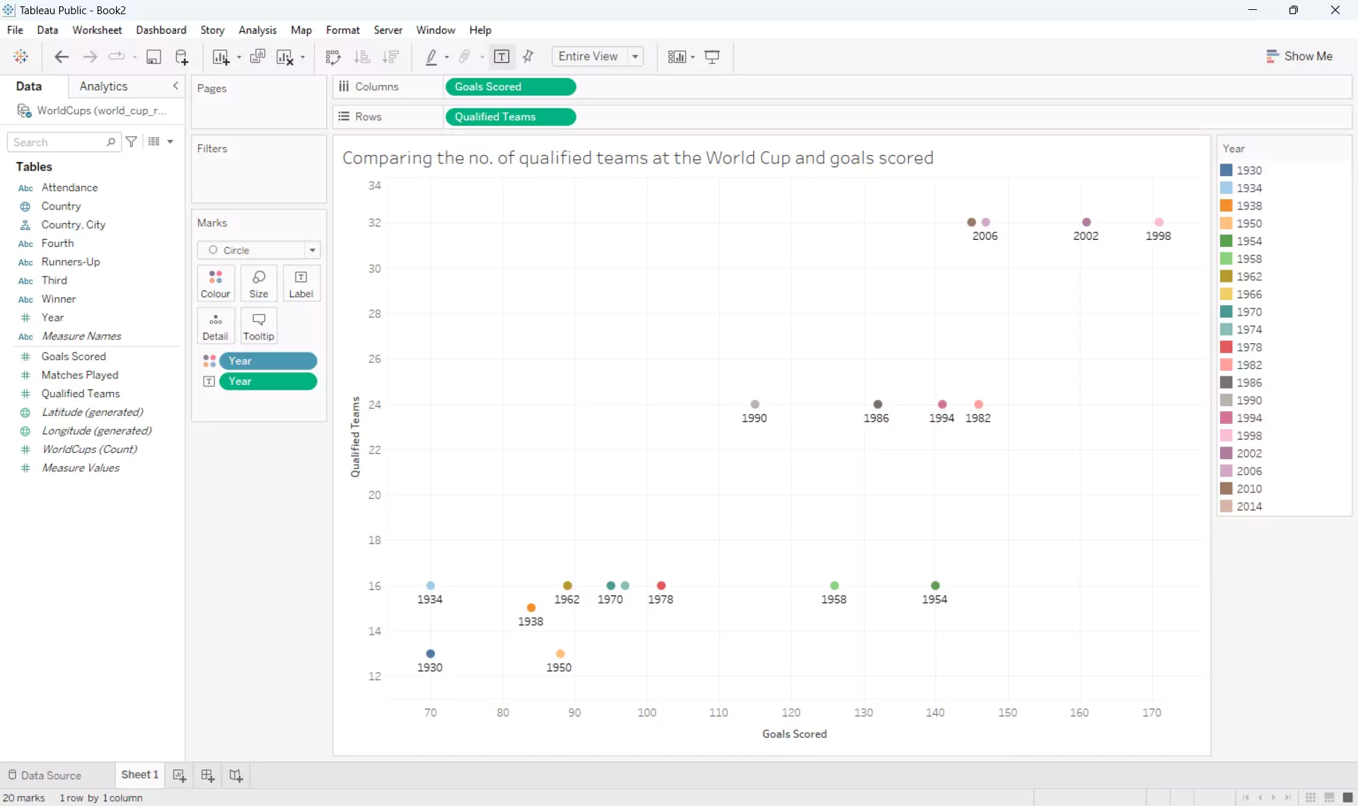
Onto the main event, the first visualisation we are creating is a scatterplot, in the world of sports analysis you will see these often used when comparing stats of multiple different players or teams. For our first scatterplot we will be comparing the amount of goals scored at each World Cup with the number of qualified teams, to see if more teams qualified leads to an increase in goals scored. Ninad walks us through the intricaces of Tableau, and explains some common workflows new users can expect when using Tableau. Once all steps have been completed you will be left with a scatterplot showcasing a fairly strong trend between the amount of qualified teams and number of goals scored, it looks rudimentary but is a good example and a great first step towards incorporating analysis in sports. This concludes the first part of the Tableau Tunnel series.
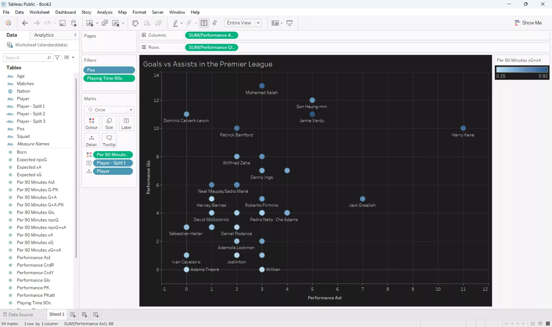
In the second part of the series we begin by learning how we can improve the scatterplot created in the first tutorial. Ninad explains the following ways in which we can enhance our visualisations:
- Theme Selection: Implement a dark theme for improved visual contrast and data prominence.
- Data Filtering: Utilize filters to isolate specific data subsets for focused analysis.
- Mark Customization: Introduce size and transparency variations to differentiate data points and reduce visual clutter.
- Colour Palette Optimization: Replace the original color scheme with a more effective and informative one.
These ideas are incorporated into a new scatterplot which shows Premier League players with the most Goals & Assists, and we also learn how to use colour to differentiate the data by the expected contribution of each player, this adds another layer of information to the graph and keeps it very easy to read, at a glance users can tell which players are under or overperforming their actual goal contribution stats.
Next, Ninad explains how we can create a bar graph using some of the Premier League data we have already used. The bar graph will show the top 10 forward players in the Premier League with the most goal contributions per 90 minutes and it will also use colour to help show how each player compares to their expected goal contribution stats. This concludes the second part of four in this Tableau Tunnel series.
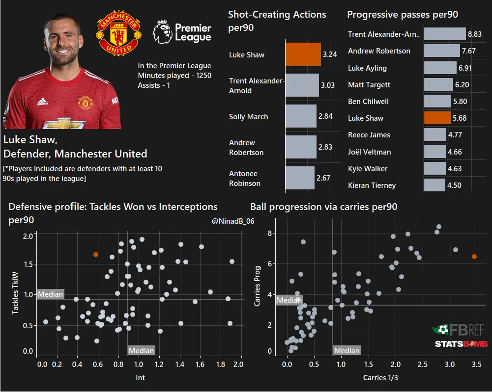
Now into the third part of the series, and with a good grasp of how to create some basic visualisations, Ninad shows us how he creates data dashboards. Dashboards are used to summarise related graphs, charts, or tables etc. onto one well presented sheet. In the case of sports analytics, specifically football in our case, these are sometimes called Player Dashboards when the focus is on just one individual.
In this part of the series Ninad also takes us through the steps of preparing our own data, another key skill for data analysts. Once connected to the data we are taken through the steps to create some scatterplots and a bar graph, armed with our new knowledge and Tableau skills this should be familiar and easy enough to complete without step-by-step instruction. Now for the data dashboard, starting with a blank canvas, we use Tableau’s container features to structure the dashboard in whatever layout would suit the size of our graphs or tables we plan to plot. This is also the part of data analysis where any layout skills you have will come in handy, as making your dashboard as easy to read and look at as possible will help make it stand out against the others, this includes optimising font sizes and labels, inluding custom images, and keeping theming consistent across all visualisations. The result? A basic yet functional player dashboard ready for further refinement. This initial foray into dashboard creation was surprisingly straightforward, opening doors to exciting possibilities for deeper data exploration and impactful visualization. This concludes the third part of the Tableau Tunnel series.
In the fourth and final part of the Tableau Tunnel series, Ninad introduces us to beeswarm plots and we will also be using a different football dataset again. Passing data of the top 5 European leagues. Firstly Ninad explains why we are using beeswarm plots and how to understand them, then we start creating our first beeswarm plot and how we use jitter to help better visualise our data. Jitter involves adding random noise to the X and/or Y co-ords so that every plot isn’t directly on top of each other which gives a better visual sense of how many plots we have at each X/Y location.
Creating the Beeswarm Plot:
-
Generate Scatter Plot: Drag “Key Passes per 90” to columns and an index function to rows. Change mark type to circles.
-
Filter Data: Apply filters for minimum played minutes and positions (optional: exclude goalkeepers).
After these steps we will have a very basic scatterplot. In the next step Ninad presents us with our first involvement with code, by using the calculated field feature in Tableau, we are given access to many different functions and coding possibilities. For the calculated field we will be using we simply require an IF/ELSE statement, a basic code block, and it has a basic outcome, to put it simply - for every alternate plot point it subtracts one from the INDEX value, and for every other plot point it adds one to the negative INDEX value. Essentially alternating all of our index values creating visual separation between our plot points.
-
Refine BI Calculation: Edit table calculation to consider the players dimension.
-
Create Bins: Apply bins to “Key Passes” measure.
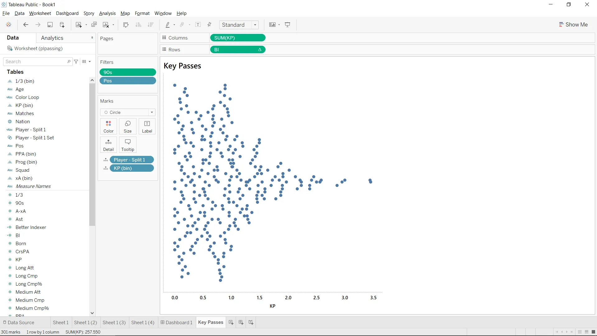
After these steps we have our first beeswarm plot, now onto improving the visual clarity.
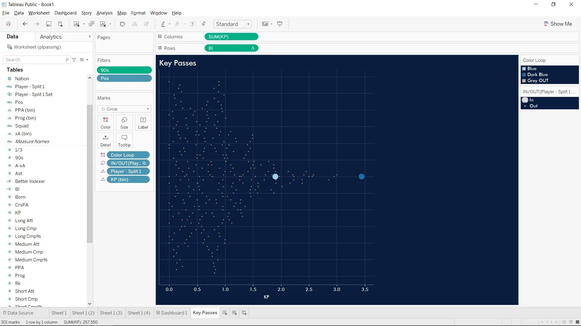
- With our new knowledge of calculated fields we can use another IF/ELSE statement to assign distinct colors to specific players.
- Adjust Mark Sizes: Create a player set and drag it to size to make highlighted players’ circles bigger.
- Theming and formatting: Edit axis titles and background/font colors, make sure theming is consistent across all worksheets, organize visuals in a dashboard using containers.
And with that, we have reached the end of Ninad’s Tableau Tunnel series, a fantastic taster into sports analytics, but this is just the beginning. The tableau of data possibilities before you stretches vast and inviting. Keep experimenting, keep pushing boundaries, and most importantly, keep asking questions.