Visualising Football: Plotting Shots and Passes
As a driven individual with a passion for both football and data visualisation, I recently embarked on a project to develop my Python skills to unlock valuable insights from match data. My existing skills and knowledge of both Tableau and Web Development have really fast-tracked my learning of data visualisation, a skill I’m eager to leverage in my professional career.
Plotting Shot Locations:
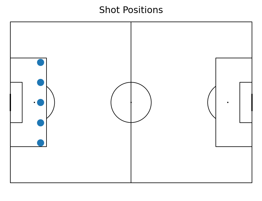
The first step for all data visualisations is to gather your data. In Football, this data can come from a variety of sources, such as match reports, player tracking data, or even your own observations. With the mplsoccer Python library, we have access to statsbomb data which makes the data gathering workflow incredibly easy. And leveraging the matplotlib and mplsoccer libraries further, we can construct scatter plots which reveal the spatial distribution of shot attempts. Each data point represents a shot on the virtual pitch, offering immediate insight into offensive tendencies and potential defensive vulnerabilities.
Here is an example of how to plot shot positions:
import matplotlib.pyplot as plt
from mplsoccer import Pitch
# Create pitch
pitch = Pitch(line_color='black')
fig, ax = pitch.grid(grid_height=0.9, title_height=0.06, axis=False, endnote_height=0.04, title_space=0, endnote_space=0)
# Create some sample data
shot_positions = [
(15, 20),
(15, 30),
(15, 40),
(15, 50),
(15, 60),
]
# Create a scatter plot
pitch.scatter(
[x for (x, y) in shot_positions],
[y for (x, y) in shot_positions],
s=500,
ax=ax['pitch']
)
# Title the plot
fig.suptitle("Shot Positions", fontsize=30)
# Show the plot
plt.show()
Output:

Plotting Pass Maps:
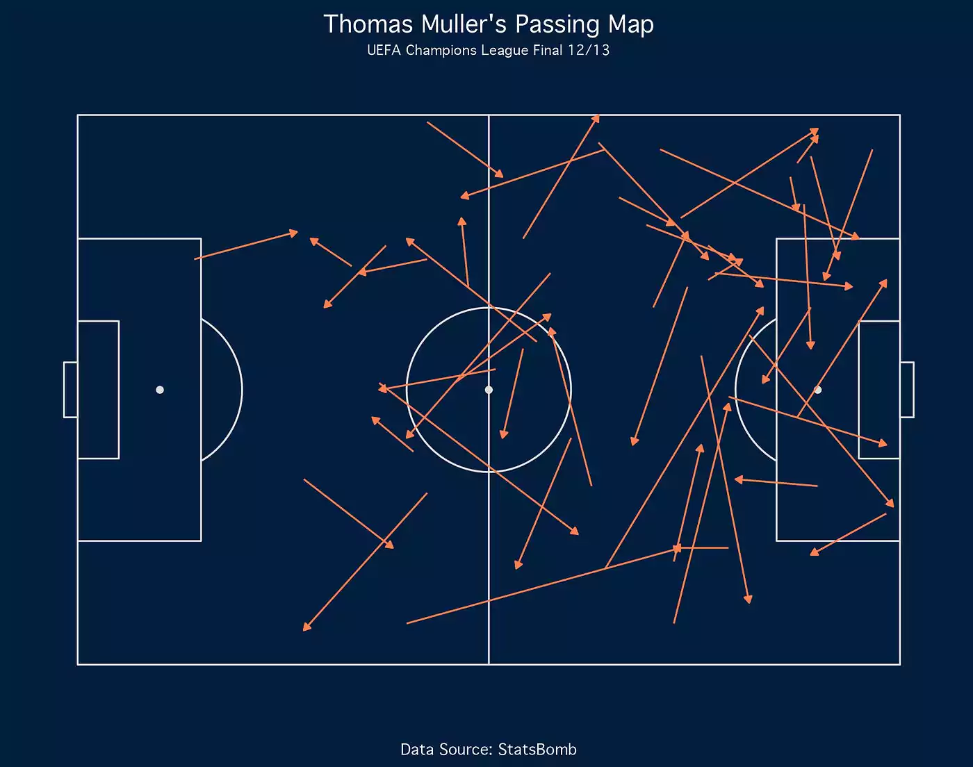
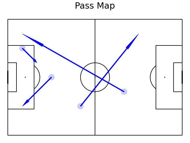
Pass maps are another useful tool for analysis. They show the flow of passes between players on the field. By recording pass start and end points, we create pass maps that depict the flow of the ball throughout the match. These intricate lines act as a visual replay, unveiling passing patterns, individual contributions, and potential areas for tactical adjustments.
Here is an example of how to create a pass map:
import matplotlib.pyplot as plt
from mplsoccer import Pitch
import pandas as pd
# Create pitch
pitch = Pitch(line_color='black')
fig, ax = pitch.draw(figsize=(10, 7))
# Create some sample data with start and end positions
passes = {
'x': [10, 30, 50, 80],
'y': [20, 40, 60, 50],
'end_x': [20, 10, 90, 10],
'end_y': [30, 60, 10, 10],
}
df = pd.DataFrame(passes)
# Iterate through the passes and plot the start and end points
for i,thepass in df.iterrows():
x=thepass['x']
y=thepass['y']
# Plot circle with start positions
passCircle=plt.Circle((x,y),2,color="blue")
passCircle.set_alpha(.2)
ax.add_patch(passCircle)
# Plot arrow with end positions
dx=thepass['end_x']-x
dy=thepass['end_y']-y
passArrow=plt.Arrow(x, y, dx, dy, width=3, color="blue")
ax.add_patch(passArrow)
# Title the plot
fig.suptitle("Pass Map", fontsize=30)
# Show the plot
plt.show()
Output:

Deeper Insights and Analysis:
These visualisations are not static tools, we can filter our data which allows for targeted analysis, such as, specific game times (e.g., the first 10 minutes of a game, or the minutes preceding/following a goal/substitution/red card); specific players; or tactical formation changes.
Ultimately, these data-driven insights translate into real-world impact. Identifying frequent shot zones reveals attacking efficiency, while highlighting key passers aids in tactical adjustments or individual player assessment. By transforming data into visual narratives, we gain a comprehensive understanding of team strengths and weaknesses, fostering informed discussions within the wider team.